Virgin.com
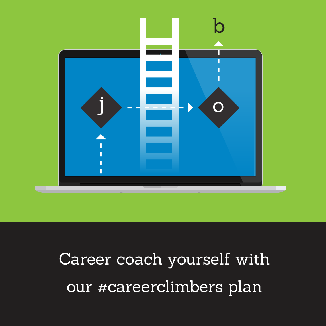
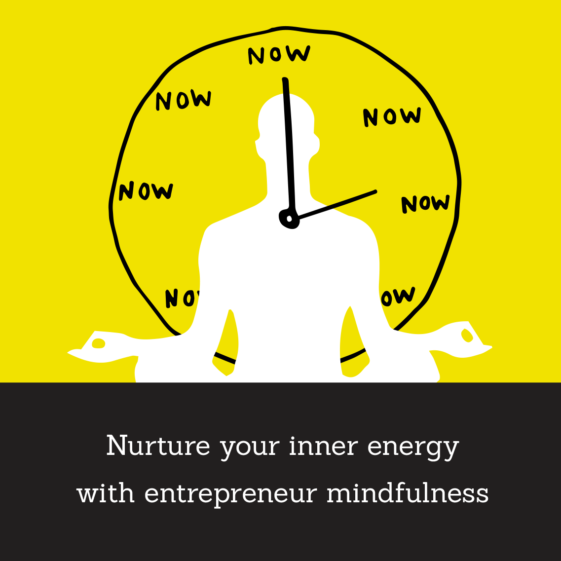
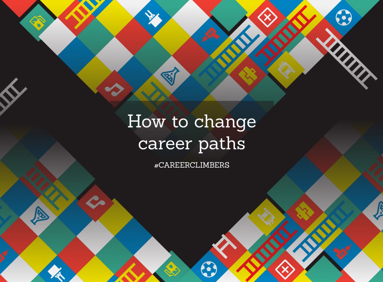
For the Change Careers theme on Virgin.com, I developed a bold, editorial design system inspired by the “game of life.” The aim was to transform complex or dry career-change content into something visually exciting, approachable, and emotionally engaging ; true to Virgin’s human, energetic tone. The design used striking, high-fidelity illustrations, abstract iconography, and responsive layouts to create a playful but polished user experience.
The icon system linked directly with the thematic headers of each article, setting a unified visual rhythm across a wide range of content types. Designed with animation and reuse in mind, each asset was optimised for web standards—built as vector, scalable, and flexible in color. This made it easy for content creators and developers to deliver dynamic, on-brand experiences without heavy asset overhead.
The system became a creative toolkit across the editorial team encouraging cohesion without rigidity. It demonstrated how a well-crafted visual language can bring life to content, enhance readability, and make abstract ideas feel clear, fun, and engaging.
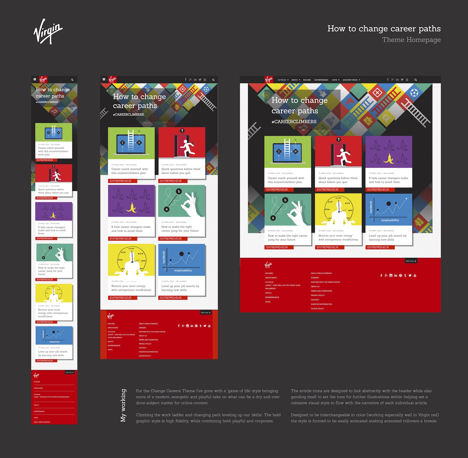


︎︎︎︎ Mobile: The design incorporates bold, recognisable elements such as Virgin Red to anchor the brand identity even on small screens. Visual storytelling is prioritised through tightly framed imagery and iconography that reinforces editorial tone without overwhelming the limited space.
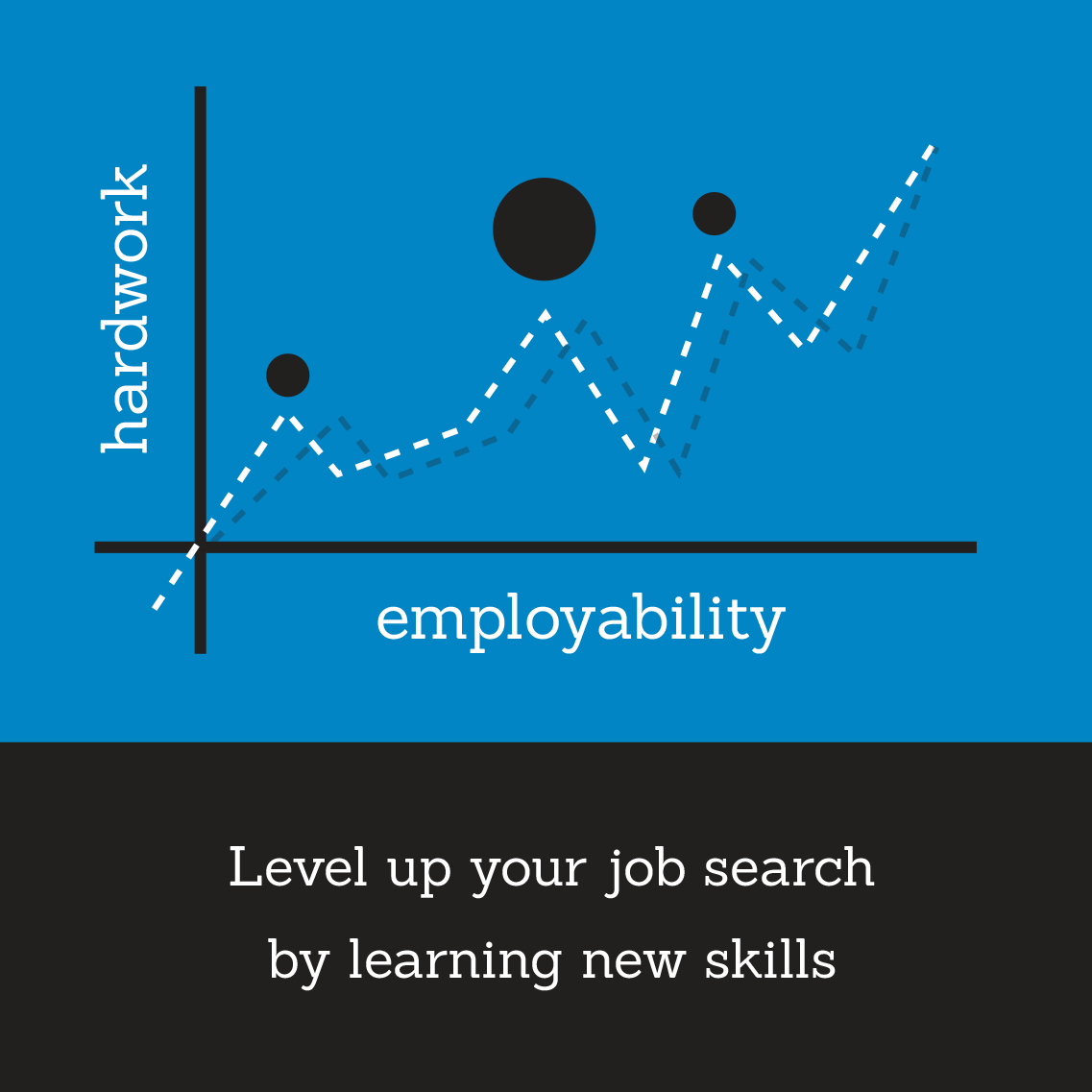
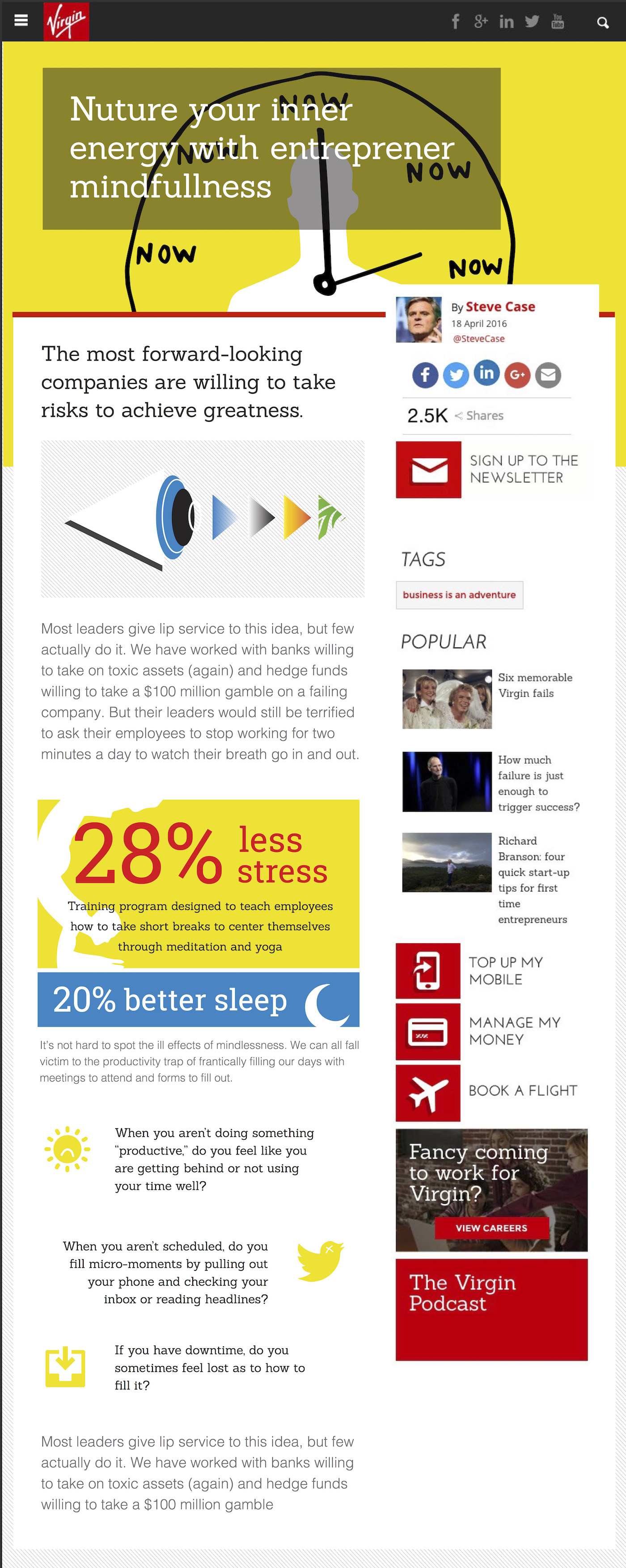
︎ Tablet: Wellness articles use an energising yellow paired subtly with Virgin Red to create contrast and clarity. Infographic-style content breaks up long-form text with digestible insights, while alternating layouts guide the eye through callouts and key questions—enhancing engagement and readability.
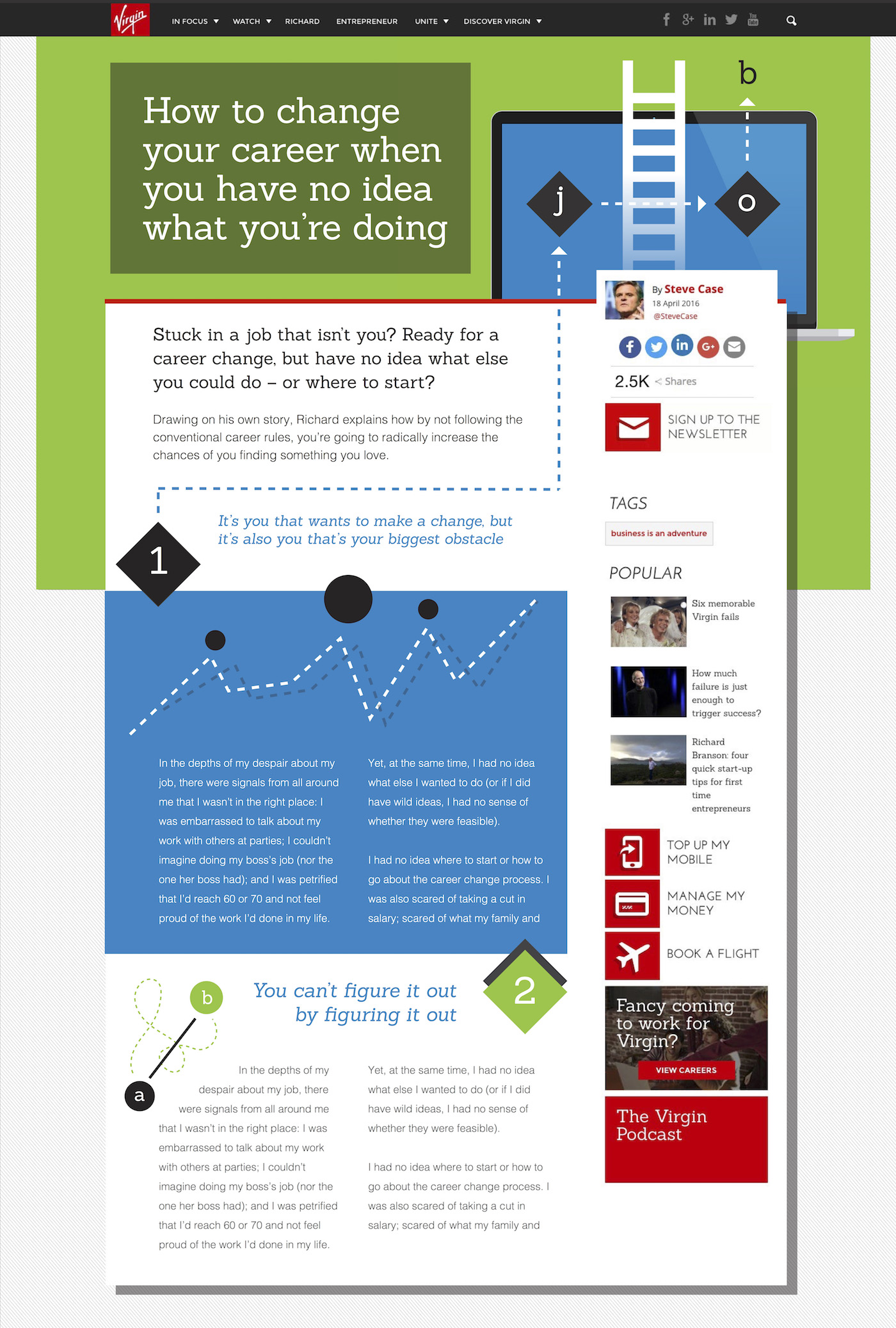
︎ Desktop: With additional screen real estate, the design allows for layered complexity. Illustrations, diagrams, and typographic details are optimised for scalable execution—ideally built using live HTML/CSS for animation and responsiveness, ensuring performance without compromising aesthetics.
︎ Tablet: Wellness articles use an energising yellow paired subtly with Virgin Red to create contrast and clarity. Infographic-style content breaks up long-form text with digestible insights, while alternating layouts guide the eye through callouts and key questions—enhancing engagement and readability.
︎ Desktop: With additional screen real estate, the design allows for layered complexity. Illustrations, diagrams, and typographic details are optimised for scalable execution—ideally built using live HTML/CSS for animation and responsiveness, ensuring performance without compromising aesthetics.
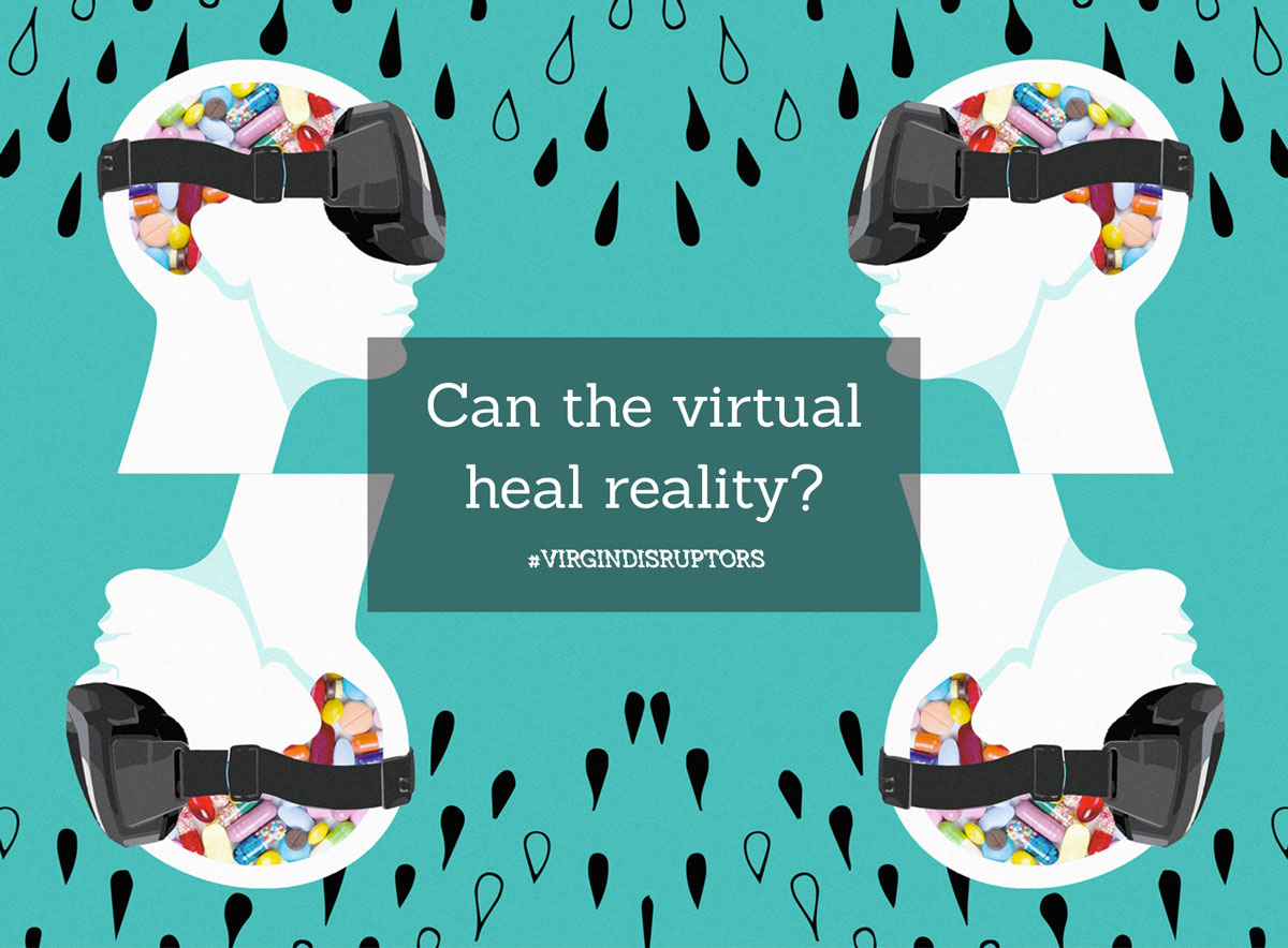
Mixed Media Illustration Style
This visual direction explores the contrast between clinical reality and emotional abstraction by combining photographic elements with bold graphic overlays. Real-world textures—such as pills, skin tones, and hardware—are juxtaposed with flat, surreal components to highlight the tension between body and technology.
The aesthetic leans into metaphor: using bright, “unreal” color schemes and stylised silhouettes to evoke questions around identity, health, and perception in a tech-mediated world. These compositions were designed for editorial and campaign use under the Virgin Disruptors umbrella.
The result is a hybrid visual language that feels simultaneously grounded and imaginative—well-suited to provoke thought while staying recognisably within Virgin’s progressive, conversation-led content strategy.